
 A comprehensive look at the wildfires raging in California and Europe compared to the 300 year averages and cataloged events.
Extreme heat compared since 1900 to see where the trend in both takes us through 2025 as the Earth dives deeper into the Eddy Grand Soar Minimum.
Planet Wide Forest & Wild Fires, Where Does it Go From Here?
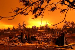
As we've seen from Europe to the United States massive wildfires, forest fires, the devastation with the loss of life, homes and firefighters stretched to the brink. Best wishes out there to everybody involved in these scenarios, and it’s really a shame that the media is pushing this as an agenda to try to prove a point that things are still revolving around CO2 warming.
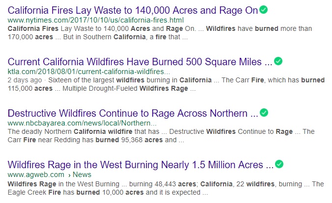
The whole climate debate says the fires are here because of something that's happening with CO2, and everywhere you look in the corporate controlled media, it's all about the number of homes that have been burned. Talking about California, you know they are building in different areas than they did in say the 1950s. Same with Europe everybody's encroaching in on the forest, building in the forest, that's a new thing, put a cabin in the forest, put a house in a forested area for neighborhoods. This is partially responsible but even AGWeb picking up on the story, bringing 1.5 million acres in this latest fire from California as a combined total.
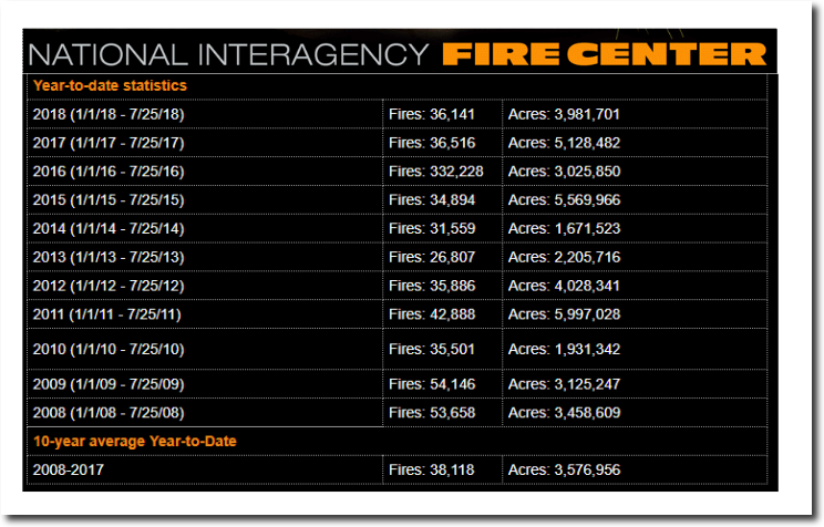
(ABOVE) So, I thought to myself, what is the exact total of area burnt? This comes from Tony Heller's site, National Interagency Fire Center year-to-date statistics. This only goes up through July 25th of 2018 from the beginning of the year at 3.9 million acres burned, but if you look at the very bottom you'll see the 10-year average from 2008 to 2017, as 3.5 million acres burned with last year again at the top of the chart 2017, 5.1 million acres. This year is actually less burned acreage than it was last year, to this point.
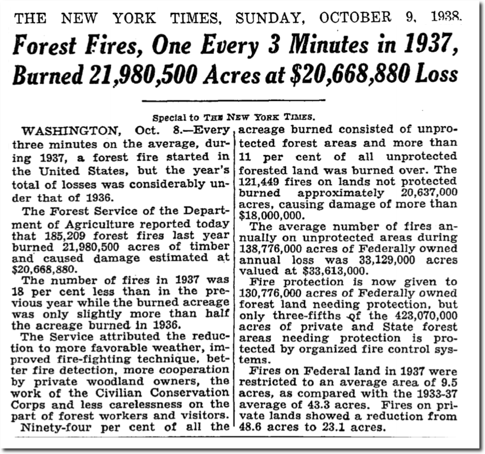
The media is going to have you believe that this is an epic all-time fire raging storm out there, but it's really just the sixth most acreage burned so far. Even if we jump back to 1937 and look at that burned acreage, twenty-one million acres, and so far in this combined fire amount it's only been three point nine million acres, that's literally five times less than what was burned in 1937.
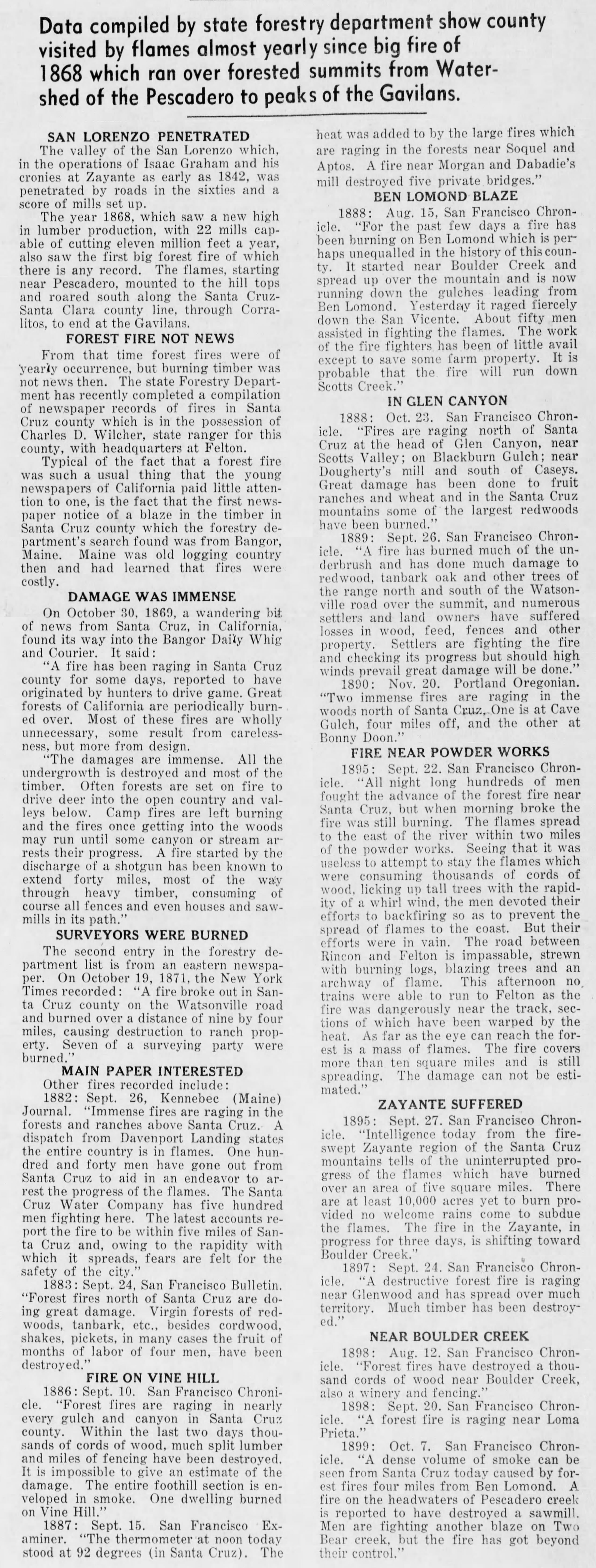
Then if you even take it back to 1868, they talk about this being the fire of all fires, it went down hills where it shouldn't have gone, it was almost as if wind was present when you read the accounts fires going downhill. It's an amazing account of what was burned and how unusual and rare the fire fronts were spreading in all directions at the same time north south east and west and the damage being immense. Well we've seen it, but back then it burned even more than today.
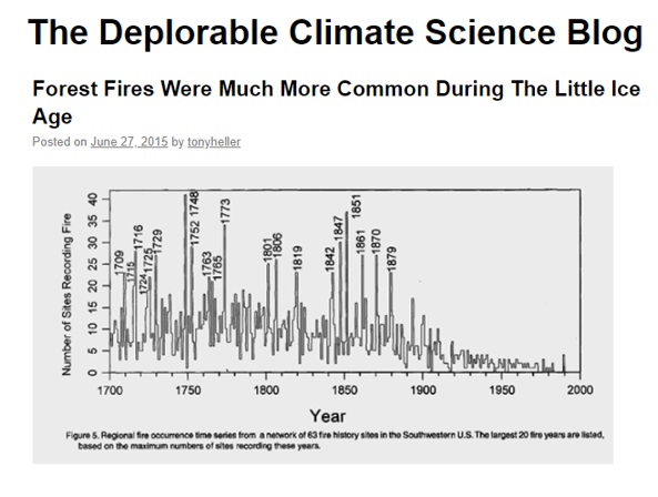
Taking a look back in time, let's go back for 318 years of time to be exact, forest fires were more common during the Little Ice Age, Maunder Minimum and a new Grand Solar Minimum is where we're heading.
This is the reason a lot of things are happening with the mixed-up weather. I want to zoom this out for you here, starting on the very left side is the Year 1700 and as we approach 1750, 1850, we can see these are the most massive upticks and the number of fires in the last 300 years. When we come to the right side, where we are now, it declines, and then the chart stops circa 1980 or so.
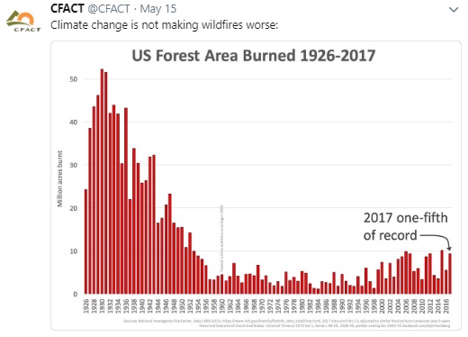
I thought, I want to fill that in and bring you a better perspective, so this one brings us all the way up to the end of last year 2017 and you saw what we had for 2018 so far in that black graph that I showed you earlier 3.9 million acres burned, this is from the US Forestry Service off of CFACT 1926 to 2017.
Now even discounting the 1750 and 1850 maximum forest fires, we go back to the 1930s, we can see that even today what's considered above normal is still only one-fifth of what was total acreage burned back in the 1930s. You should also be asking some of these newspapers and news outlets how are they reporting that, it's such an Armageddon type event although totals in the past were much larger.
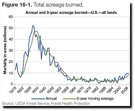
(ABOVE) When you can clearly see it through the historical record we're at a pretty low total going forward, although it's terrible to be involved in such a thing and my prayers and wishes for your safety out there during these events. I'll bring you another chart, this is even a little further back this is from 1916, that previous chart in the red was from 1926, so you see wherever you're looking we're getting the same information on the time dates here, moving averages of annual acreage burnt was far higher in the 1930s.
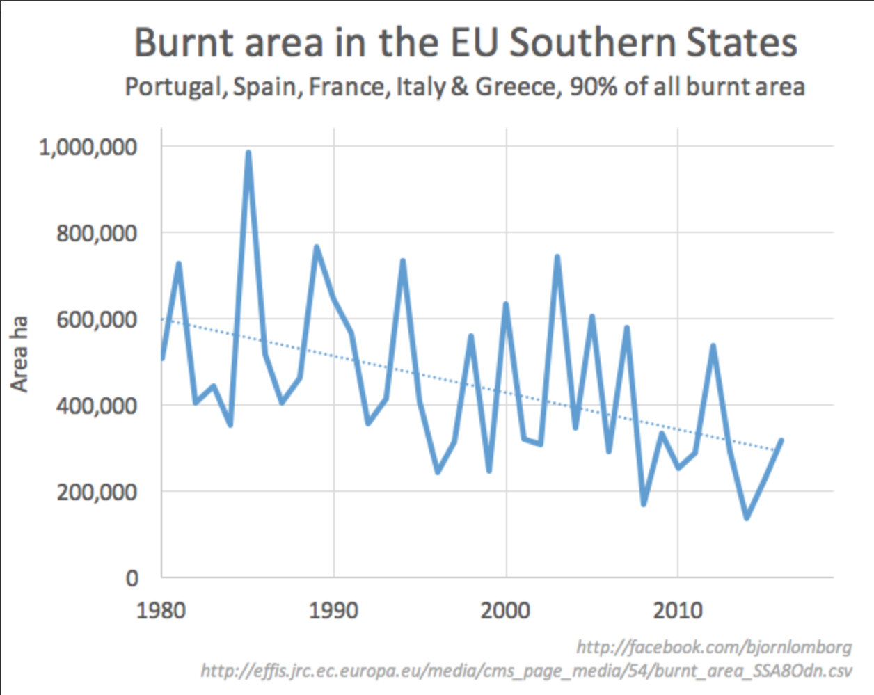
(ABOVE) Over in the E.U, the European Union, that would be Portugal, Spain, France, Italy and Greece, they encompass 90 percent of all the burnt areas through Europe. Around 1985 at a million acres burnt, they have been declining since. Also speaking of Spain and Portugal extreme heat over there, that's from the Equatorial Vortex, because our jet streams are shifting due to a weakening magnetosphere as we slide deeper into this new expanding Eddy Grand Solar Minimum.
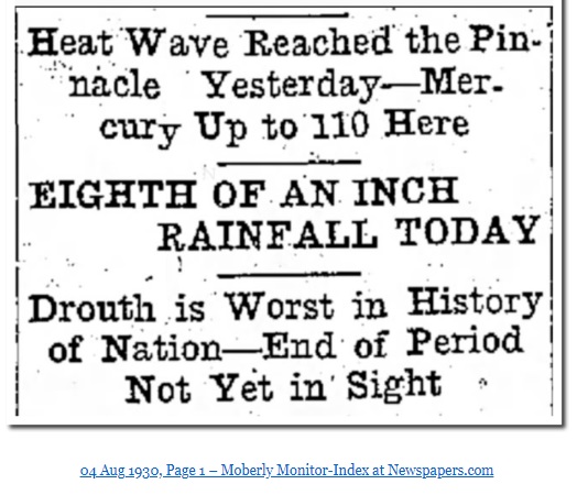
We'll keep hearing about heat during this time too, it's the all-time record heat, heat, heat, heat, everything. Heat wave reached the pinnacle yesterday up to at least 110 degrees Fahrenheit, drought in the worse history of our nation in the United States, if you're a citizen there. Oh, this comes from 1930 August 4th.
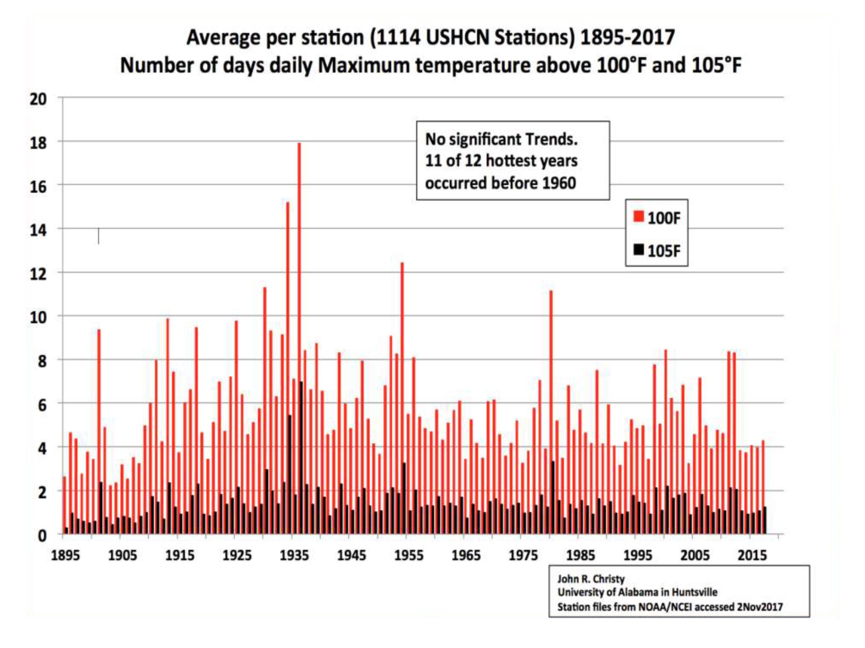
We keep hearing the exact same thing, today right? Let's compare some hot temperatures because the media loves to talk about temperature, so let's compare. This comes from the University of Alabama Huntsville, this maps out through time, days eclipsing 100 degrees Fahrenheit(100F) and also eclipsing 105 degrees Fahrenheit (105F). We are on the far right of the chart, media is telling you it's the hottest ever but what happened in 1935, what happened in 1955, how about 1980 we're lower than that?
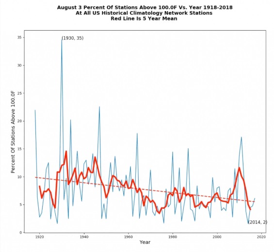
I thought all right, this is just a single chart overlay so let's see if we can dissect it a little further. This is a 100-year chart 1918 to 2018, all Climatology Network Stations in the United States. I see that huge heat spike again back in the 1930s and it looks like it's been declining ever since, those are the days at 100 degrees Fahrenheit or above (100F).
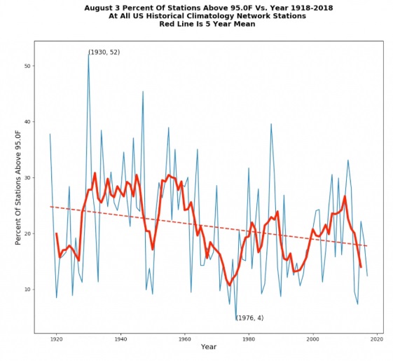
(ABOVE) I thought maybe if it's 95 degrees Fahrenheit (95F) and above we could see some sort of uptrend. I still see that spike in the 1930s again in this hundred-year chart all climatology stations, and the trend, that's a downward trend.
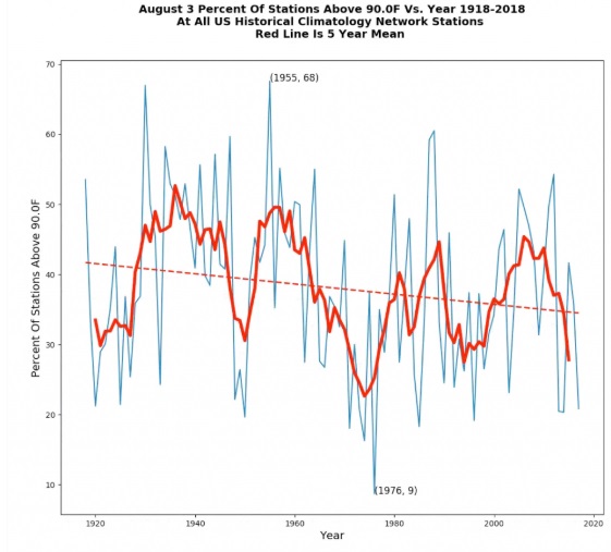
I thought okay, well if it's really going to be that hot at least the days above 90 degrees Fahrenheit (90F), we're just going to blow through the record, every day has got to be at least above 90F the way the media is portraying it and everything is cooking. The planet is cooking, everything's like hundreds of degrees. I also see multiple spikes here 1930s, 1950s, 1980s, but that trend is downward, makes you wonder if there is an agenda to push warming! But why?
PDF of this Article Planet Wide Forest & Wild Fires, Where Does it Go From Here?
FULL VIDEO Planet Wide Forest & Wild Fires, Where Does it Go From Here?
Join ADAPT 2030 NEWSLETTER https://www.oilseedcrops.org
***Mini Ice Age Conversations Podcast***
- iTunes: https://itunes.apple.com/us/podcast/adapt2030
- Soundcloud: https://soundcloud.com/adapt-2030
- Libsyn: http://adapt2030.libsyn.com/
- BitChute: https://www.bitchute.com/hashtag/adapt2030
- Brighteon: https://www.brighteon.com/channel/adapt2030
- YouTube: https://www.youtube.com/user/MyanmarLiving
- Keep ADAPT 2030 independent: paypal.me/adapt2030
- Patreon: https://www.patreon.com/adapt2030
- Steemit: https://steemit.com/@adapt2030
- Medium: https://medium.com/@globalcooling
- FB: https://www.facebook.com/Miniiceage
- Twitter: https://twitter.com/adapt2030
- GAB: https://gab.ai/adapt2030
- Revolution Radio: Studio A – Thursday Nights – 10 PM to Midnight E.S.T. http://www.Freedomslips.com
- Content Created & Produced by David DuByne https://www.oilseedcrops.org